Analytics
This section describes the various dashlets within the Analytics section of the Dashboard.
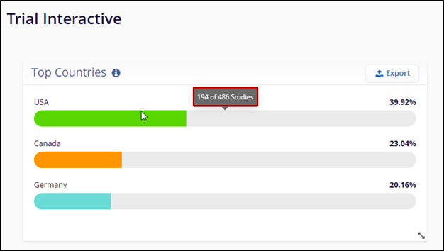
Top Countries Dashlet
The Top Countries dashlet within the Portfolio dashboard t shows the three countries with the highest percentage of studies that include at least one site, counting each study once per country, regardless of site count.
This dashboard offers a quick snapshot of study distribution by geography, helps users to identify where the clinical trials are most commonly conducted.
Percentages are calculated based on the presence of site locations across all studies tracked within CTMS.
Users can use this view to:
- Understand geographical trends in the study portfolio
- Support strategic planning and resource allocation
- Identify regions with high clinical trial activity for further analysis
A user can perform the following actions on this dashlet.
- Hover over each bar to reveal the total number of studies associated with that country compared to the overall studies.
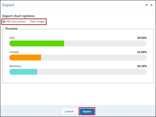
- Click on the Export button to export the chart in different file formats.
- Click either on the PDF Document or PNG Image radio button from the Export Chart Options screen.
- Click on Export once the required option is selected.
TransPerfect’s Trial Interactive is an industry leader in practical, global eClinical innovation
PRODUCTS
 Linkedin
 X
X
Didn’t find what you need?
Our dedicated Project Management and Client Services team will be available to meet your needs
24 hours a day, 7 days a week.
Toll Free:
(888) 391-5111
help@trialinteractive.com
© 2025 Trial Interactive. All Rights Reserved
