Activities
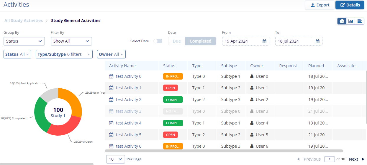
The Activities dashlet displays a high-level summary of activities grouped by status for study, country, and site level activities. Users can apply filters to view activities by type and other criteria. Each chart provides a visual breakdown, and clicking a segment opens a detailed grid view for deeper analysis. Refer to the sequence in the screenshot below to understand the characteristics of the Activities dashlet.
- Apply the Group by and Filter By criteria by selecting from the available dropdown options and the charts will be populated with data accordingly. Additionally, apply the Status, Type/Subtype, and Owner filters to customize the charts.
- Apply the date range filters by specifying a range of dates (From and To) and choosing a predefined viewing period for displaying data within that timeframe. Turn on the Select Data toggle to add the date range.
- Click on the Pie Chart, Bar Chart, or Histogram icons to choose between different types of
charts for data visualization.
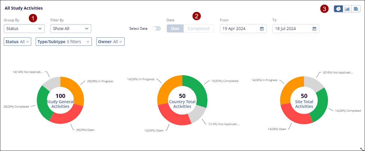
- Click on an individual chart and it displays the Activity details in a tabular
format.
Note:
- The Export functionality is similar across all the dashboards. Refer to any one of the sections where Export functionality is detailed.
- The functionality to switch to Details view (by selecting Details) is standard across all dashboards.
TransPerfect’s Trial Interactive is an industry leader in practical, global eClinical innovation
PRODUCTS
 Linkedin
 X
X
Didn’t find what you need?
Our dedicated Project Management and Client Services team will be available to meet your needs
24 hours a day, 7 days a week.
Toll Free:
(888) 391-5111
help@trialinteractive.com
© 2025 Trial Interactive. All Rights Reserved
